Template Design Tool
In This Topic...
Templates are used to define custom HTML content that can be used in dataviews, table columns, links, and other data elements.
The Editing group contains the following standard options.

|
Open | Opens the Select Template panel with the Templates group expanded, providing access to the existing templates. If a template is already open, it will be closed without saving. |

|
Save | Saves the current template. |

|
New | Opens the Select Template panel with the General group expanded, allowing the creation of a new template. If a template is already open, it will be closed without saving. |

|
Options | Opens the Configuration panel with the General group expanded, providing access to the settings for the current template. |

|
Export | This option is not available for this tool. |

|
Import | This option is not available for this tool. |
Select Template Panel
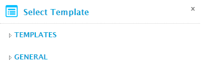
The Select Template panel opens to the right of the screen when selecting Open or New from the Edit group. Click X to close the panel again.
The options are divided into groups, depending on which feature opened the panel.
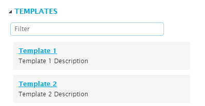
Templates
This group is used to open an existing template saved in the system.
Click the name to open the template in the Template Editor. Text can be entered into the Filter field to find specific templates.
General
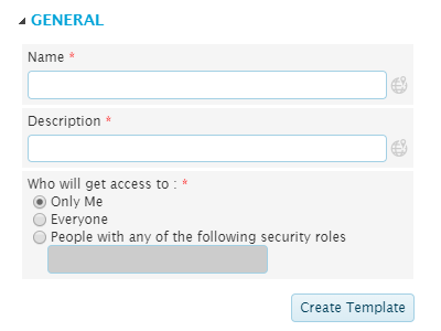
This group is used to create a new template.
| Name | Enter the name of the new template. |
| The text in this field can be translated |
|
| Description | Enter a description of the template. |
| The text in this field can be translated |
|
| Who will get access to | Select if the template is private or shared. This affects the ability to see and edit the template in the Template Design Tool, and the ability to see the template in Analysis mode. |
| Only you will be able to see this template. | |
| The template will be visible to all users. | |
| Only accessible to users with a specific security role assigned to their user account. Select this option and enter the Code of the required security role. | |
| Multiple roles can be provided, formatted as comma-separated and without spaces. If a user has at least one of these roles, they will be able to see the template. |
Click Create Template to display the template in the Template Editor. Note that the template is not yet saved at this point.
Template Configuration Panel
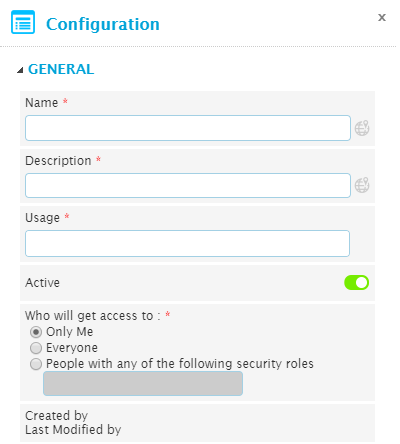
The Configuration panel opens to the right of the screen when selecting Options from the Edit group. Click X to close the panel again.
This panel is used to edit the configuration options for the current template.
| Name | The name of the template can be changed. |
| The text in this field can be translated |
|
| Description | The description of the template can be changed. |
| The text in this field can be translated |
|
| Usage | Select where the template is meant to be used. This determines if the template will be available for selection in each area. This field displays the number of areas selected. |
| The template can be selected as static content for a cell in the dashboard. | |
| The template can be selected as content for a table column. | |
| The template can be selected as a custom link format. | |
| The template can be selected as a custom display mode for dataviews. | |
| Active | Select if the template is active. An inactive template will still function in any existing configurations, but cannot be added to new configurations. |
| Who will get access to | Select if the template is private or shared. This affects the ability to see and edit the template in the Template Design Tool, and the ability to see the template in Analysis mode. |
| Only you will be able to see this template. | |
| The template will be visible to all users. | |
| Only accessible to users with a specific security role assigned to their user account. Select this option and enter the Code of the required security role. | |
| Multiple roles can be provided, formatted as comma-separated and without spaces. If a user has at least one of these roles, they will be able to see the template. | |
| Created by | Identifies the date and time the template was created, and the user who created it. |
| Last Modified by | Identifies the last date and time the template was changed, and the user who made the changes. |
Changes are saved when the template is saved.
Template Editor Screen
The Template Editor screen is used to build and test the custom HTML content.
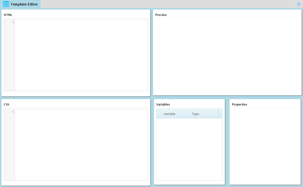
The screen is composed of five cells.
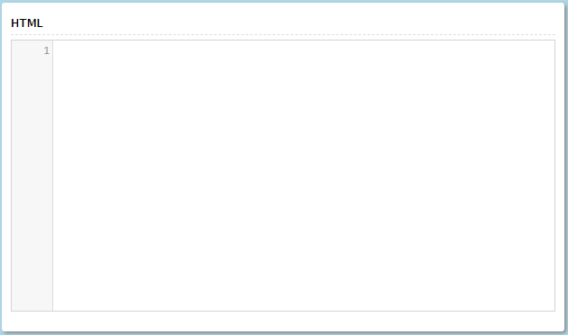
The HTML cell is used to enter the HTML code. The editor uses common color-coded formatting to present the HTML structure.
Variables can be inserted into the HTML code, allowing dynamic data to be taken from other sources. To insert a variable, enter the name of the variable between two dollar signs ($), then place the cursor anywhere within the variable name and press Alt+Enter. The variable is added to the Variables list.
A variable can be renamed by changing the text and using Alt+Enter to add it to the Variables list again. Note that the original variable will still exist in the list, and will need to be deleted manually.
In addition to variables, the editor supports custom HTML tags.
| <RepeatPerRow> ... </RepeatPerRow> | This tag is used to repeat the content between the tag and closing tag for each row in a table. |
Note: Templates only support basic HTML content. Content in Java, Flash, or other formats is not supported.
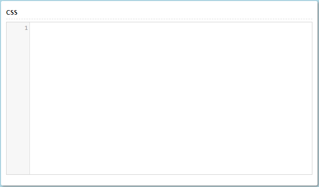
The CSS cell is used to enter any CSS code that should be applied to the HTML. CSS is not required, as all formatting can be applied locally within the HTML content, but it may be simpler for complex or recurring formatting.
Variables can be inserted into the CSS, allowing the formatting to be adjusted by dynamic data in the dashboard. To insert a variable, enter the name of the variable between two dollar signs ($), then place the cursor anywhere within the variable name and press Alt+Enter. The variable is added to the Variables list.
A variable can be renamed by changing the text and using Alt+Enter to add it to the Variables list again. Note that the original variable will still exist in the list, and will need to be deleted manually.
The Preview cell displays the results of the current HTML and CSS. Any variables will be displayed using their default values.
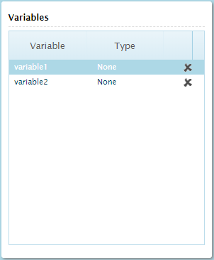
As variables are added to the HTML and CSS cells, they appear in the Variables list. Click on a variable to view the details in the Properties cell, or click the Remove icon  to delete the variable.
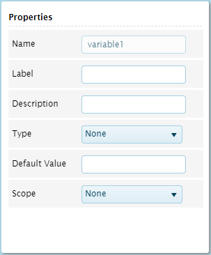
The Properties cell contains settings for variables listed in the Variables cell. Click on a variable in the Variables cell to view the details.
When all changes have been made, click Save to save the template.

